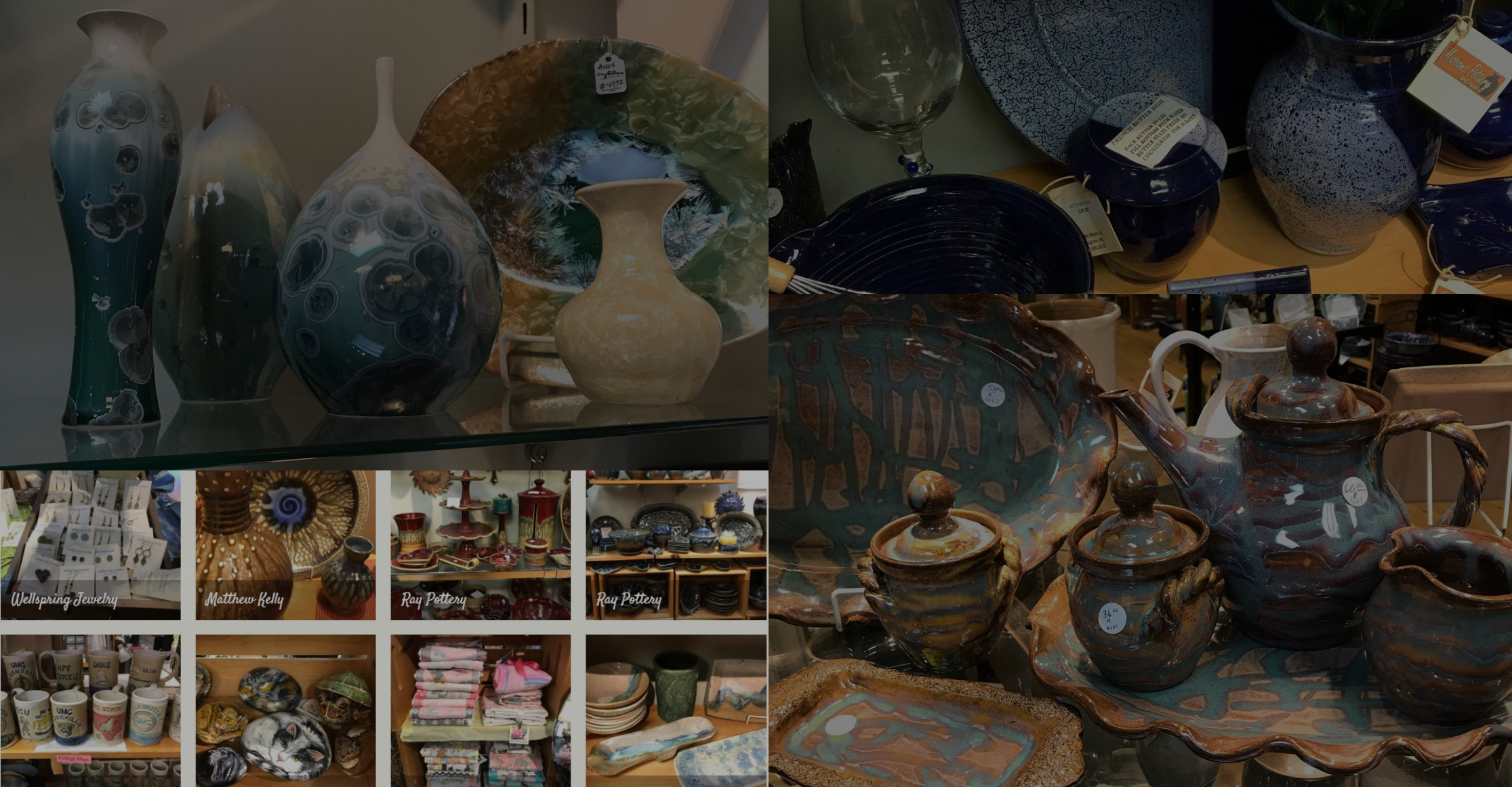
Seagrove pottery of Cary
We sell functional and decorative pottery, jewelry, candles, artwork, ornaments, blankets, wood creations, dip mixes and more!
Goal: Build an e-commerce portal for a local pottery and art gallery named “Sea grove pottery of Cary” Provide an option for users to shop online
User interviews
4
Timeline
2 Weeks
My Role
UX/UI designer
Tools
Axure ,Figma
The Challenge:
I was tasked to redesign the website of a local small business to build e-commerce capabilities which would help their sales during pandemic.
I chose Sea Grove Pottery of Cary. A boutique pottery and décor store that sells products made by local artists. It is a fantastic store - with a wide range of pottery and home decors items - that is trusted and highly rated by the local community.
The Process
DISCOVER
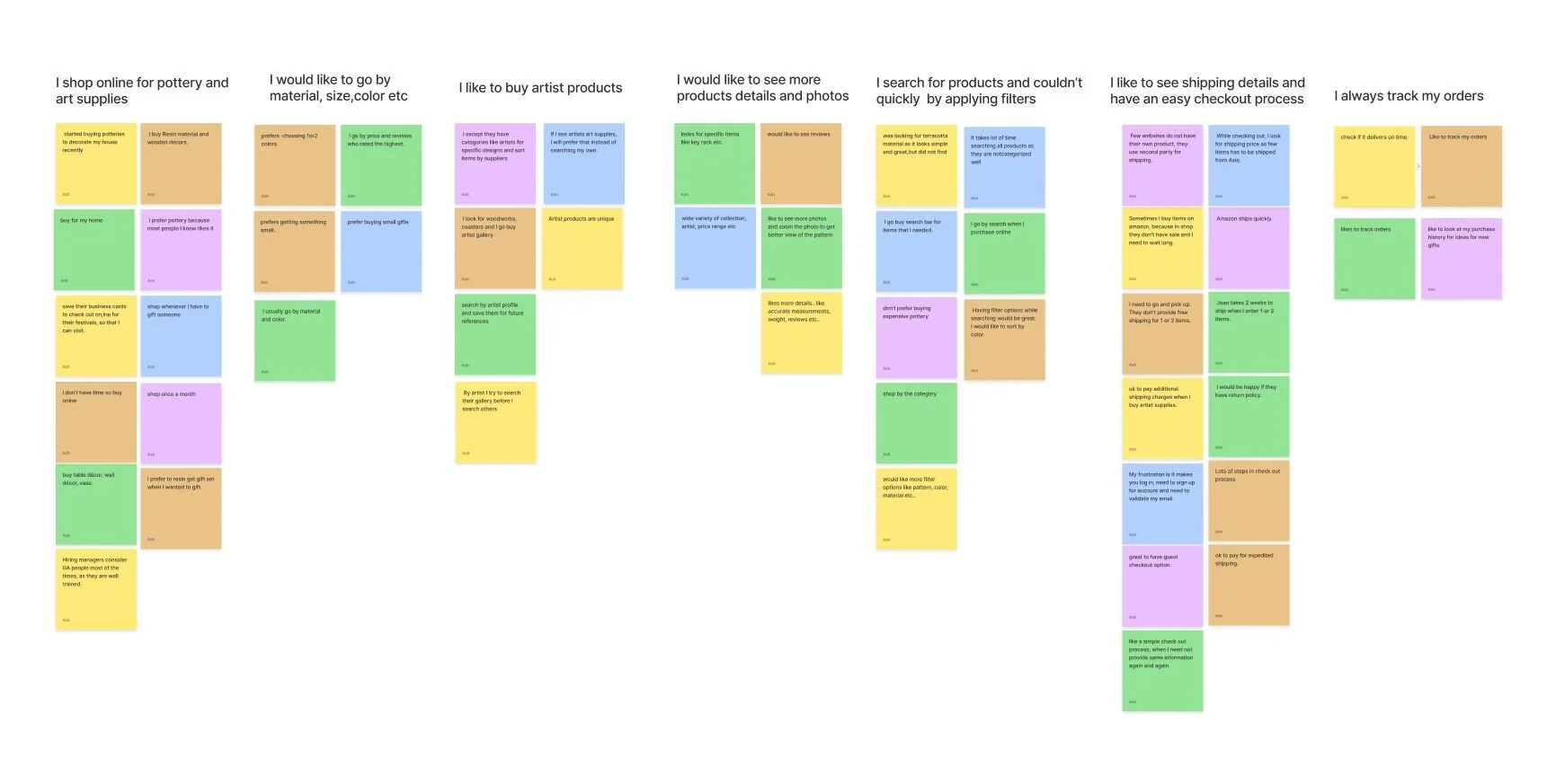
User Research and Interviews
Affinity Mapping
Competitive and comparative analysis
DEFINE
Card sorting
Persona’s
Problem Statement
Solution Statement
DESIGN
User flow
Sketches
Site map
Mid fidelity prototype
Usability Testing
DELIVER
Hi-fidelity prototype
DISCOVER
Understanding our users
I interviewed 4 users who frequently buy pottery from local gallery. It helped me understand their motivations, priorities and how it influences the choices they make.
Key Insights:
User behavior changes based on buying scenarios: gifting vs purchasing for themselves
Loyal to their favorite artists
Likes to know a lot about the product before they buy
Prefer an easy checkout process
Who is the Competition?
For a local business, like Sea Grove pottery of Cary, the primary competitors are major online art retailers and large retain chains that focus on home décor.
The analysis highlighted:
The need for a detailed product description with multiple high-resolution images
The need for users to filter and sort by multiple categories
The need for a simple check out process
Analysis of e-commerce giants helped me get more insights..
I performed comparative analysis with the most popular online retailer (amazon.com) and a department store that caters to an upscale cohort (bloomingdales.com) to understand how the products are categorized.

How synthesizing research helped me to understand our users
Someone who spend lot of time to understand the product
Overwhelmed by the check-out process
Follows local artists and prefer to buy from favorite artists
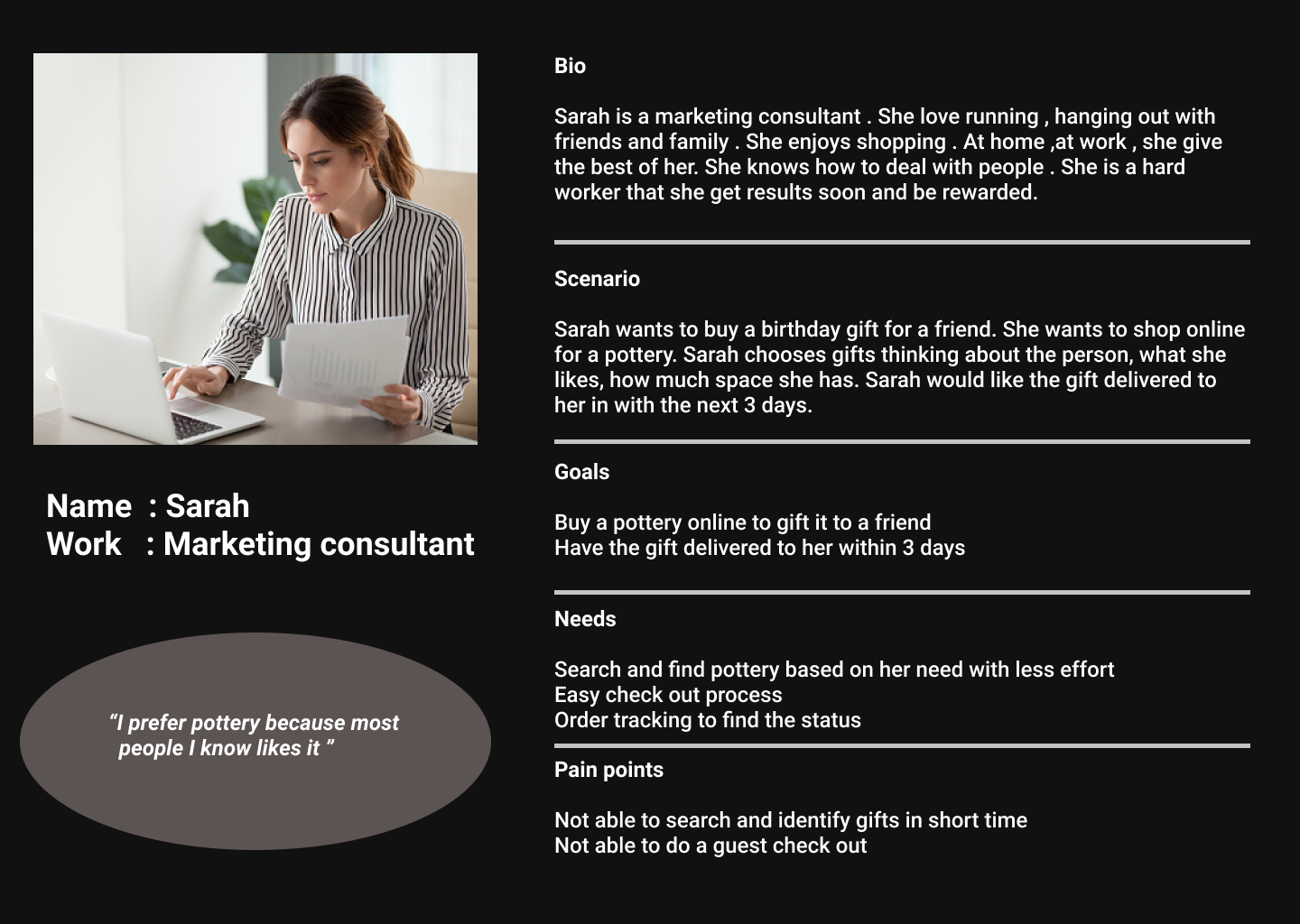
Personas
Based on the analysis, personas reflect two groups of users with distinct behaviors. Primary persona represents the user who buys pottery and art supplies for gifting purposes and secondary persona represents users who buys pottery for decorating their home.

Design goals based on the research was to:
Reduce navigational clutter
Introduce a streamlined filtering system that allows people to hone in on their preferences instead of navigating through the whole website to find a product.
An easy checkout process that is consistent with the overall site design
The inclusion of “order tracking” section that allows user to track their orders and view order history.
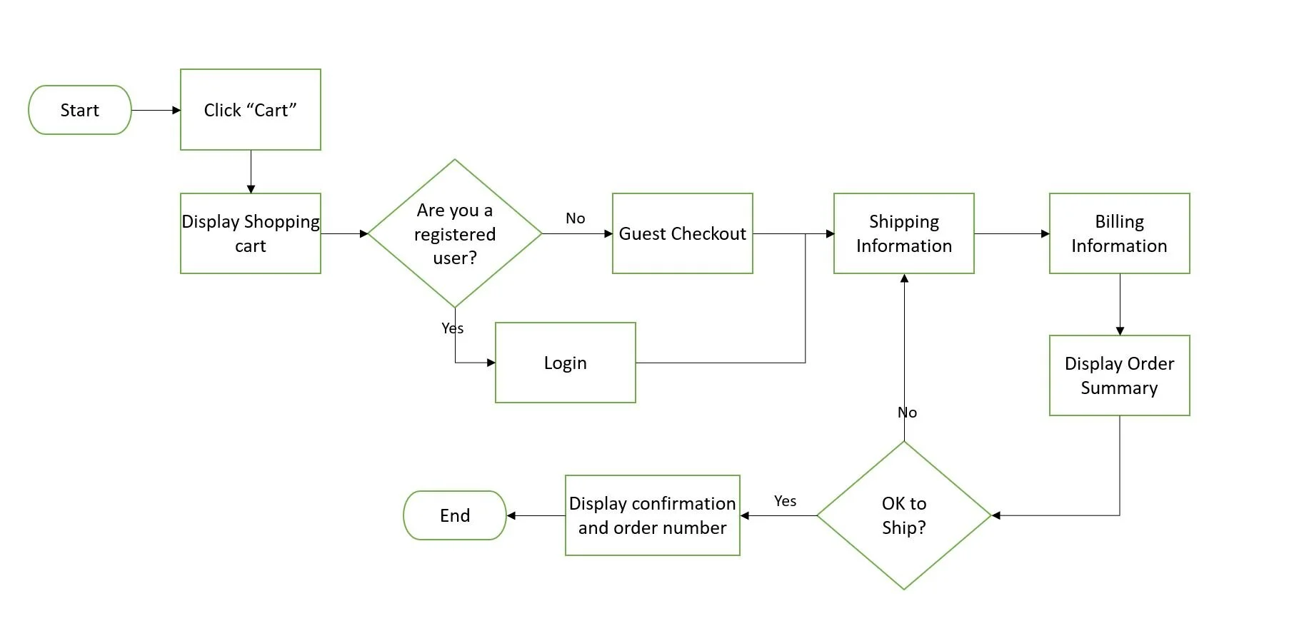
User flows
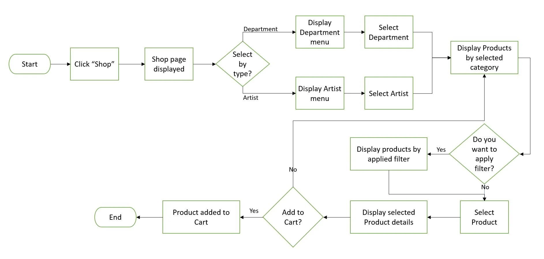
How card sorting helped me to create a site map
Given that the gallery has 100+ products, I ran a card sort to understand how users would like the products categorized and created a site map to reflect the information architecture of the redesigned website

From sketches to Prototype
With the design goals in mind, I developed sketches to define the layout and navigation. My initial sketches did not have a main navigation bar to shop by artist collections . Later, included that during my design iterations.
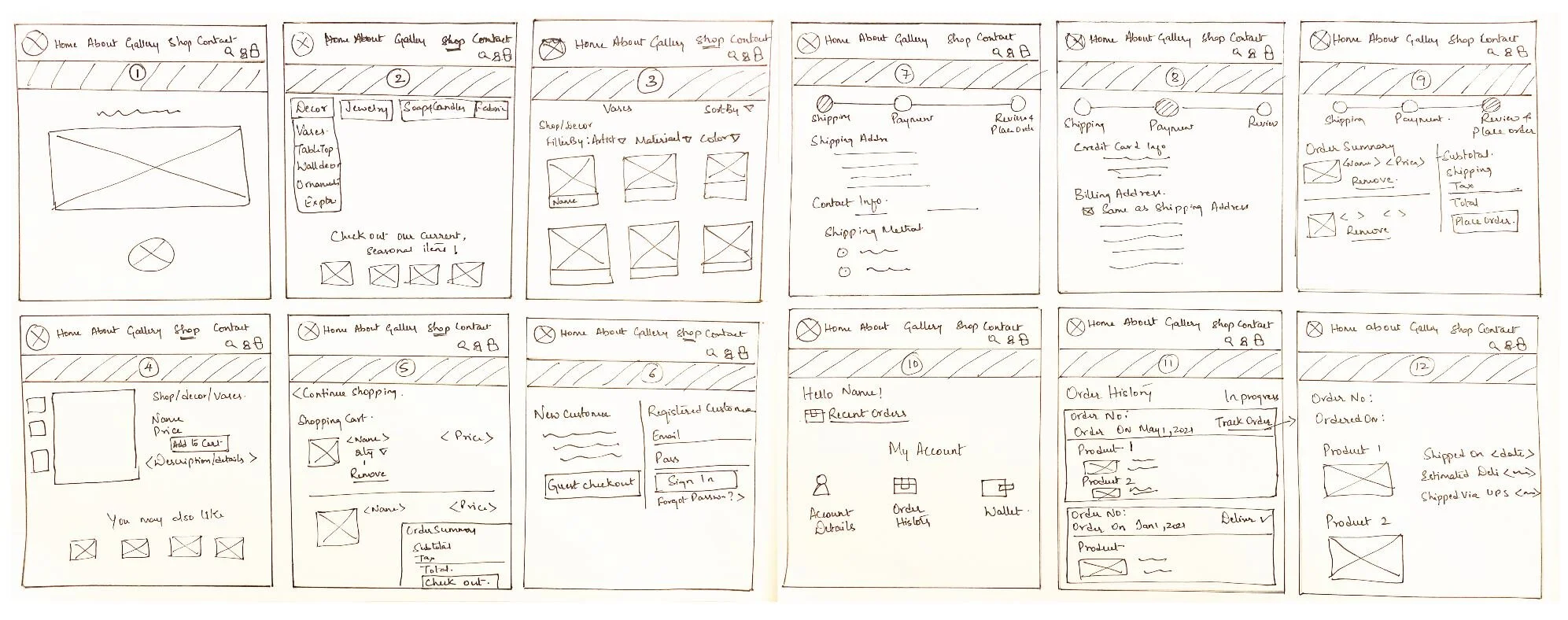
How design iterations evolved
I created low fidelity wireframes in Axure and conducted usability testing. Made changes to the main navigation bar by providing an option to shop by artist . Also moved my filtering options towards left side of the page and provided an option to select multiple filters for each product and helping users get what they exactly wanted.
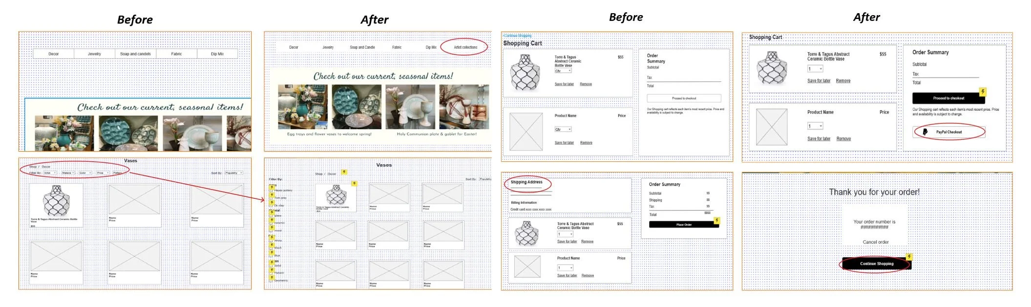
Usability Testing results and feedback helped me fixing hi-fi prototype
3 Users tested the prototypes. Received purposeful feedback which were addressed in future iterations:
Filter options are not in the right location on the page
Alternative payment options not available
Do not have ability to view shipping and billing information before I confirm purchase
Cancel order options are not available.
DELIVER

Outcome
The final design reflected all the features and insights that I got through user interviews and card sorting. Keeping in mind the essence of Sea Grove pottery shop and having categories for all their items, clear and multiple pictures for product details, with essential filters to help users to search through the products quickly and enhance their shopping experience by providing users with easy checkout process and order tracking facility. This allows users to easily find their desired products and the business is able to maintain a trustworthy online presence.
Reflections
This was my first e-commerce project owning the end-to-end user experience design process. Picking a gallery that sells pottery and decor created by local artist, made me think of how to effectively capture the essence of a brand online, something that I determined is a lot harder than it looks. It was also in this process that I realized how card sorting and usability testing can provide valuable insight on how to proceed with a solution.